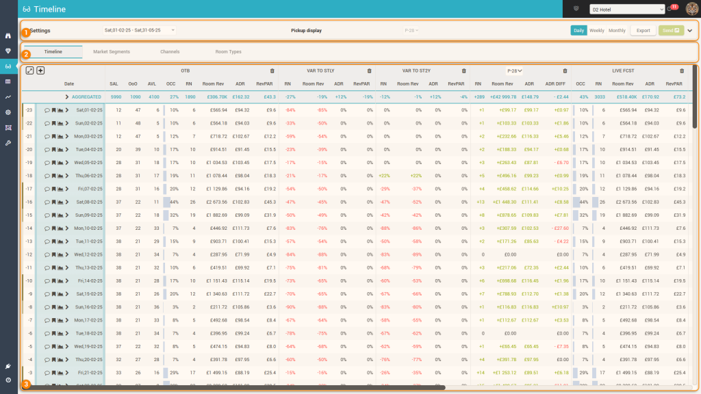
Arguably, the most used screen in the application is the Timeline screen. It allows the users to see all the data from the app (from different “angles”) and it also provides quick access to various controls.
The screen looks like this:
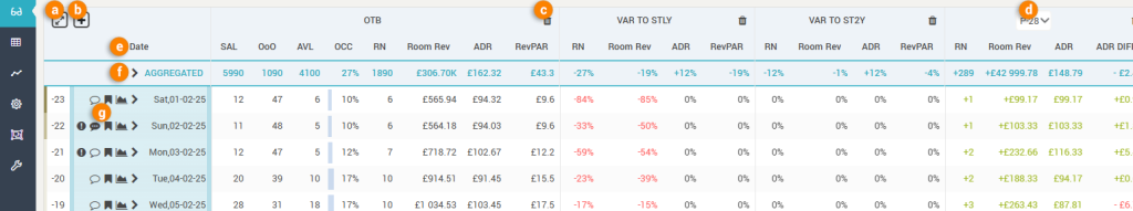
1. The Control Bar
The control bar presents to the user various options for viewing and using the data displayed:

a. The “Period Selector” allows users to choose the timeframe they wish to analyze:
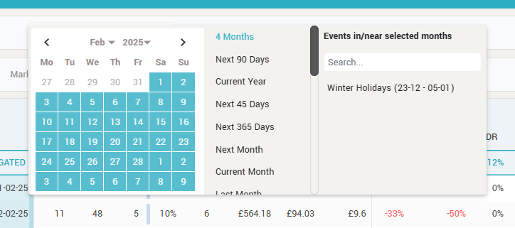
Users can opt to select a custom period by using the calendar, they can select a predefined period from the list of most usual timeframes and also can select the period of specific events which happen in or near the selected month in the calendar.
Tip: The list of most usual timeframes is ordered based on usage, with the most used periods being higher in the list.
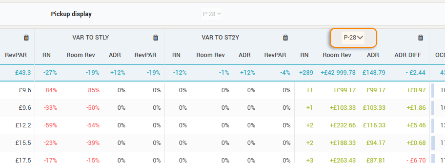
b. The Pickup display option allows to select which pickup period is to be displayed. The app has 10 predefined pickup periods to choose from (for any other custom period users must use the “Pickup Report” screen).
Attention: The option is disabled when viewing the “Timeline” tab because when viewing the data in the Timeline grid, the pickup selector is part of the grid itself (for convenience) – see below:
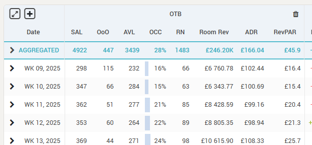
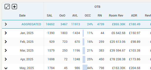
c. The granularity selector allows users to choose how the selected timeframe is presented in the data grid: per day, per week or per month:
| Daily granularity | Weekly granularity | Monthly granularity |
 |  |  |
d. The Export button is used to export the grid to Excel:
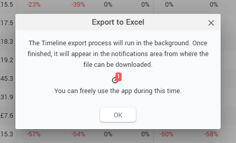
The export process happens in the background, so users can use the app while the report is being generated. Once finished, the users can see a notification that the file is ready to be downloaded.
Attention: the exported file will contain exactly the same data as displayed in the grid, no more, no less.
e. The SEND button is used to send any pricing decisions made directly in the data grid to the receiving system. For more information about the SEND button, please see “The SEND Button” page.
f. Expending the bar by clicking the “arrow” icon (or anywhere inside it), more controls are available:
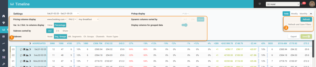
- This area provides the following extra controls:
- Pricing columns display – allows the selection of the channel, the occupancy and the meal type for which shopped rates are displayed in the grid, for both the subscriber hotel and the competitors.
- Var. to / Dist. to columns display – controls if the various data columns that contain variances or distances (e.g. “Var to STLY”, “Var to 2Y”, “Dist to Budget”) are to display their data in absolute values or in percentages.
- Subrows sorted by – here users choose how are the sub-rows (see below) supposed to be sorted from top to bottom. The options are to sort them alphabetically (A-Z or Z-A) or by “Share” – share meaning “by Occ. OTB in descending order”.
- Attention: this option is only active for the “Timeline” tab
- Subrows – allows to select by which criteria should the data be “segmented” when “opening” a row. The options here depend on the type of the PMS connection (e.g. if the “Channels” option is not available it means the PMS system does not send data at this granularity).
- Attention: this option is only active for the “Timeline” tab
- Dynamic columns sorted by – When looking at the data from the “Timeline” tab, columns can be ordered manually (see below). For all the other tabs, this parameter controls the order (from left to right) in which the columns are presented. The segments (or channels or room types) can be ordered alphabetically or by “share” (same as above for the subrows sorting).
- Attention: this option is not active for the “Timeline” tab, as the columns in the Timeline tab view can be ordered manually.
- Display columns for grouped data – Market segments and Channels can be grouped in the app into “Segment Groups” or “Channel Groups”. With this parameter, users control if the data, at segment group level (“Market Segments” tab) or channel group level (“Channels” tab), is to be displayed along with the rest of the columns.
- Attention: if this is “on”, the group columns are ordered first based on the “sorted by” control above; then the “segment” columns within each “group” are ordered in the same way and displayed after their parent “group” columns.
- Attention: the “group” columns have their header and values “underlined” for easier identification.
- While changing any of the “main” controls (timeframe, pickup and granularity) triggers a grid refresh automatically, for the additional controls the “Refresh” button must be pressed, so that the changes take effect in the grid.
- Remember: users can “save” their preference on how the grid is to be displayed by clicking the “Refresh and Save Filters” button.
2. The “Tab” selection
In this part of the screen, users can choose the “segmentation” by which they want to see the data:

a. Timeline
The “default” way at looking at the data (property level). In this view, the grid displays not just business data received from the PMS, but also market data and the calculated forecast and RECO. Below the list with all the currently available data; the order is irrelevant as users can change the order in which the columns are displayed by preference:
- ON THE BOOKS – shows the business on the books information (latest data received from the PMS)
- SAL – total number of rooms for sale.
- OoO – total number of rooms marked “Out of Order” or “Out of Service”. SAL + OoO = Hotel Capacity.
- AVL – total number of rooms available for sale.
- OCC – occupied rooms in percentage from Capacity (or “Capacity – OoO” – see “Occ and RevPAR Base” parameter in “Settings->Basic“).
- RN – total number of occupied rooms.
- Room Rev – total accommodation revenue received (past days) or “definite” expected (future days). This can be either gross or net revenue (net of VAT / sales tax), based on the “Display Revenue with Tax (VAT/GST)” parameter in “Settings->Display“.
- ADR – the average room rate calculated based on the RN and room revenue.
- RevPAR – the Revenue per Available Room calculated based on Occ and room revenue.
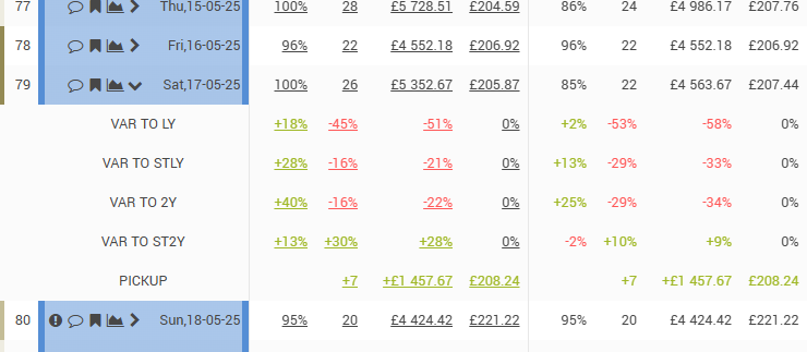
- STLY / ST2Y– shows the business data for the previous year’s (or 2 years before) date or period (if the granularity is Weekly or Monthly) corresponding to the respective arrival date with the same number of days before arrival as between the current date and the respective arrival date. E.g. “today” is 01.04.2025 and the arrival date is 10.04.2025; STLY will show data for 11.04.2024 as it was on 02.04.2024. ST2Y will show data for 12.04.2023 as it was on 03.04.2023.
- VAR TO STLY / ST2Y – shows the differences between the data on the books and the data from STLY / ST2Y. The difference is displayed either in absolute value or in percentage, based on the control “Var. to / Dist. to columns display” explained above.
- LY / 2Y – shows the final (actual) values from the corresponding dates (periods if the granularity is Weekly or monthly) of the previous year and previous second year.
- VAR TO LY/2Y – shows the differences between the data on the books and the data from LY / 2Y. The difference is displayed either in absolute value or in percentage, based on the control “Var. to / Dist. to columns display” explained above.
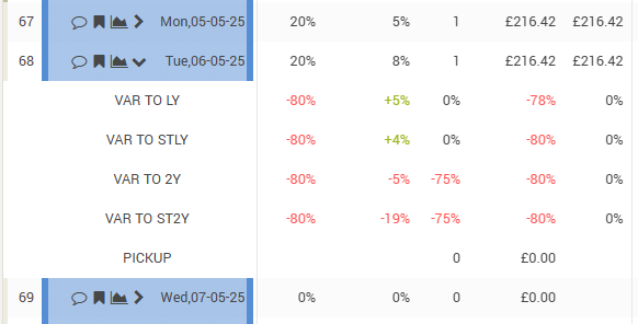
- PICKUP – shows the business that was picked up in the selected period. The grid offers a selection for the pickup period (P-1 = “yesterday’s pickup”, P-2 = “pickup in the last 2 days”, etc). If the hotel is using one of the PMS providers where the RMS is connected in a “real-time” or “near real-time” frequency, the option P-0 (meaning “Pickup of Today”) is also available.
- Attention:
- The Pickup ADR is only calculated for positive pickups, as it is supposed to represent the ADR of the picked-up business
- The Pickup data includes cancellations – e.g. a pickup of “+3” could mean an actual pickup of 5 new bookings with 2 cancellations
- The “ADR DIFF” column shows the difference between the ADR as it was on the books before the pickup period vs the current ADR on the books.
- Attention:
- BW (Booking Window) – shows the business that was picked up in the selected booking window. While for the “PICKUP” data, the periods are always “linked” to the current date, for BW the periods are relative to each respective arrival date.
- BW 0 – 1 means business generated on the previous date and the arrival date
- BW 2 – 3 means business generated 3 + 2 days before the arrival date
- BW 8 – 14 means business generated 14 + 13 + 12 + 11 + 10 + 9 + 8 days before the arrival date
- Attention: while it would be expected that BW data is calculated only for past dates, the system will calculate BW data for future dates as well if the BW period is in the past. E.g. if today is 01.04.2025 and the arrival date is 04.04.2025, the system will calculate “BW 8-14” for 04.04.2025, as the period is in the past (“BW 8-14” for 04.04.2025 is the business made from 22.03.2025 to 28.03.2025)
- DBA – shows the business that was on the books with as many days before arrival as selected.
- DBA -1 means final (actual) data on the books for the respective arrival date. It is equal to the values ON THE BOOKS (for past dates).
- TIP: while the values ON THE BOOKS are summated for the “AGGREGATED” row of the grid, the values in the “DBA -1” columns are averaged
- DBA 0 shows the data on the books as it was in the morning of the respective arrival date
- DBA 1 shows the data on the books as it was on the morning of the previous date
- etc.
- DBA -1 means final (actual) data on the books for the respective arrival date. It is equal to the values ON THE BOOKS (for past dates).
- LIVE FCST – shows the forecast calculated by the system’s forecasting algorithm. For more information on the algorithm, see “The Optimization Algorithm” page.
- Remember: the system calculates a forecast only for the total business and the TRANSIENT business (that is, business generated on the market segments that are linked to the “TRANSIENT” segment group).
- DISTANCE TO LIVE FCST – shows the difference between the calculated FCST and the values on the books.
- RECO / RECO DIFF – column set that shows the calculated optimal price recommended (RECO) and the difference between the latest calculated RECO and the RECO as it was calculated at a different moment in time. These columns also provide interactive functionality:
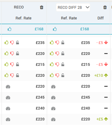
- Users can “like” or “dislike” the recommended price.
- When the “like” icon (green thumbs-up) is clicked, the RECO value is prepared to be sent to the receiving system as the new price point for the reference offer (along with all the other price dependent offers).
- When the “dislike” icon (red thumbs-down) is clicked, the users are prompted to enter a new price amount, which is then prepared to be sent to the receiving system as the new price point for the reference offer (along with all the other price dependent offers).
- In both scenarios above, once like or dislike is pressed, a new icon (
 ) will appear next to the existing ones, which allows users to “undo” the action and as such, clear the action from the list of price points prepared to be sent to the receiving system.
- The like / dislike icons appear only for the arrival dates that are not in control by any auto-pilot workers (more info on “Auto pilot” functionality here). If dates are controlled by at least one auto-pilot worker, the like/dislike icons are replaced by the “autopilot” icon (
 ).
).
- On hovering over the auto-pilot icon, info on the auto-pilot worker is displayed:
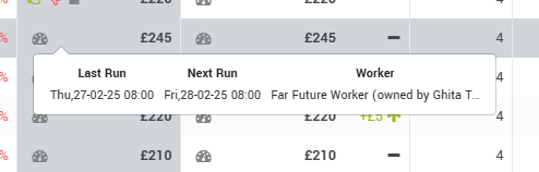
- Users can click the auto-pilot icon and override the workers. When clicked, the icon will disappear and the like/dislike + the lock/unlock icons will be displayed.
- The lock/unlock icons (
 ) allow quick access to locking/unlocking a particular arrival date.
- A locked arrival date means the prices will not be changed by any auto-pilot workers (unless they are given permission to also change locked dates). Also, when changing rates in bulk in the “Pricing” screen, there are some options related to the arrival dates being locked.
- Best Practice: When overriding an arrival date from being changed by a worker and thus being “managed” manually, it is recommended to also “lock” the respective date after the “like” / “dislike” action; otherwise the worker will change the rate again by itself (to the newer RECO amount) the next time it runs, effectively cancelling the user decision.
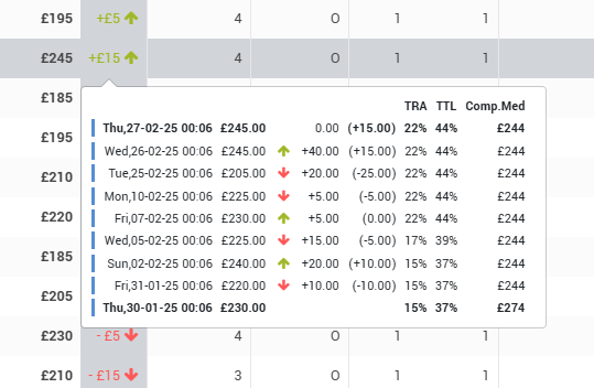
- The “Diff” column displays the difference between the current RECO and the RECO at the select time (RECO DIFF LAST meaning whenever the last RECO was calculated, RECO DIFF “X” meaning RECO calculated “X days ago”). When hovering the mouse over it, the app will display the evolution of the RECO in the selected period and some additional info (evolution of the transient and total occupancy + evolution of the CompSet Median):
- STATUS / MIN LOS – show the recommendation for Closing/Opening the hotel and the recommendation for setting a MinLOS restrictions at hotel level.
- BUDGET / FORECAST – shows the business budgeted / forecasted by the users in the “Budget/Forecast” screen.
- DISTANCE to BUDGET/FORECAST – shows the differences between the data on the books and the budgeted / forecasted data. The difference is displayed either in absolute value or in percentage, based on the control “Var. to / Dist. to columns display”.
- MY HOTEL – shows the following data:
- LB / UB – the lower and upper bounds, as defined for the season (or event category) in which the respective arrival date is.
- SENT – the last price amount that was sent to the receiving system
- To be Sent – the actual amount that will be sent to the receiving system, after applying any modifiers (“Settings->Distribution“) and caps or hurdles (“Hurdles and Caps“).
- BAR (or LAR) – shows the BAR or LAR (Rate Plan Type Display parameter in the “Settings->Basic” screen) of the hotel as shopped based on the selected “Pricing columns display” controls.
- An “R” to the left of the price amount indicates the value is for a restricted rate.
- If the values are displayed in “italics”, it means the least expensive offer found is not mapped to the “reference offer” (“CompSet Room Type Mappings“).
- If there is an “exclamation” mark next to the rate, it means that the shopper did not find a rate available when scraping for LoS = 1, but found for LoS 2 or 3, etc and the value displayed is calculated by dividing the shopped amount to the LoS (thus arriving to a “per day” estimated price point).
- Rates from the scraper’s “last scheduled shop” are displayed in full color, while rates within the freshness period are displayed in a “faded” mode to visually indicate they are “fresh enough” for the RECO algorithm to use them but they are not as fresh as they should be (meaning not from the “last scheduled shop”). The freshness is defined in the “Settings > RECO” screen (the “Data Freshness” section).
- Special “codes” are displayed in the situation when no price was found:
- “PAXC” – when the scraper did not find a price for the selected PAX, but it did find rates for at least one other PAX
- “C” – when the scraper did not find any price for any PAX and any other LoS. The scraper automatically tries longer lengths of stay (+1 and +2 nights) when nothing is found for the LoS searched.
- “-” or an empty cell is displayed in case of scraper errors
- COMPSET – shows the BAR (or LAR) for each competitor as shopped based on the selected “Pricing columns display” controls.
- The values are colored based on their “relation” vs the subscriber’s own shopped rates:
- Green means the Competitor’s rate is higher than the defined comfort zone (“Settings->Competitors“) vs the hotel’s own rate
- Red means the value is lower than the comfort zone
- Blue means the value is within the comfort zone
- An “R” to the left of the price amount indicates the value is for a restricted rate.
- If the values are displayed in “italics”, it means the least expensive offer found is not mapped to the “reference offer” (“CompSet Room Type Mappings“) of the subscriber.
- If there is an “exclamation” mark next to the rate, it means that the shopper did not find a rate available when scraping for LoS = 1, but found for LoS 2 or 3, etc and the value displayed is calculated by dividing the shopped amount to the LoS (thus arriving to a “per day” estimated price point).
- Rates from the scraper’s “last scheduled shop” are displayed in full color, while rates within the freshness period are displayed in a “faded” mode to visually indicate they are “fresh enough” for the RECO algorithm to use them but they are not as fresh as they should be (meaning not from the “last scheduled shop”). The freshness is defined in the “Settings > RECO” screen (the “Data Freshness” section).
- Special “codes” are displayed in the situation when no price was found:
- “PAXC” – when the scraper did not find a price for the selected PAX, but it did find rates for at least one other PAX
- “C” – when the scraper did not find any price for any PAX and any other LoS. The scraper automatically tries longer lengths of stay (+1 and +2 nights) when nothing is found for the LoS searched.
- “-” or an empty cell is displayed in case of scraper errors
- The values are colored based on their “relation” vs the subscriber’s own shopped rates:
- MARKET – shows the DEMAND index as calculated by the system based on number of available hotels in the destination and the destination’s filters.
- Attention: the destination filters are controlled during the onboarding process (“Implementation form“) and can only be changed afterwards by the technical support team.
If the “Subrows” parameter is not “None”, users can “open” rows in this view to go in-depth with the analysis based on the selected segmentation:
Remember: The subrows are sorted top-bottom based on the “Subrows sorted by” parameter.
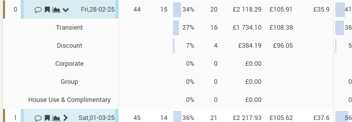
b. Market Segments
The bare minimum granularity of the data received from any PMS system is at “market segment” level, so this tab is always visible. The only condition for this tab to not be present is when the hotel itself decides not to work with any type of segmentation. In this view, the grid will display columns showing data per market segment (and segment groups if selected – “Display columns for grouped data” above).
For each segment, the following data is displayed:
- Share – shows the calculated share (in percentage) of the RN on the books for the specific segment from the total RN on the books occupied. If “Dynamic columns sorted by” is by “Share”, this is the data field the sorting is done by.
- RN – the number of occupied rooms for the specific segment.
- Room Rev – accommodation revenue received (past days) or “definite” expected (future days) for the segment. This can be either gross or net revenue (net of VAT / sales tax), based on the “Display Revenue with Tax (VAT/GST)” parameter in “Settings->Display“.
- ADR – the average room rate of the segment, calculated based on the RN and room revenue.
When “opening” a row, the following can be seen:

The “VAR TO …” rows show absolute values or percentage values based on the “Var. to / Dist. to columns display” parameter.
The “PICKUP” row shows the generated pickup in the period selected with the “Pickup display” parameter in the control bar.
Remember: you can choose to see only market segments or both segment groups and market segments with the help of the “Display columns for grouped data” parameter. There is no separate tab just for segment groups.
Best practice: When the hotel has many market segments, it is recommended to sort the dynamic columns by “Share”; thus having the most productive segments to the “beginning” of the grid (left), while the less productive segments are to the “end” (right).
c. Channels
This view is available only if the PMS system is sending data at channel granularity. In this view, the grid will display columns showing data per channel (and channel groups if they exist and “Display columns for grouped data” is selected).
For each channel (channel group), the following data is displayed:
- Share – shows the calculated share (in percentage) of the RN on the books for the specific channel from the total RN on the books occupied. If “Dynamic columns sorted by” is by “Share”, this is the data field the sorting is done by.
- RN – the number of occupied rooms for the specific channel.
- Room Rev – accommodation revenue received (past days) or “definite” expected (future days) for the channel. This can be either gross or net revenue (net of VAT / sales tax), based on the “Display Revenue with Tax (VAT/GST)” parameter in “Settings->Display“.
- ADR – the average room rate of the channel, calculated based on the RN and room revenue.
When “opening” a row, the following can be seen:
The “VAR TO …” rows show absolute values or percentage values based on the “Var. to / Dist. to columns display” parameter.
The “PICKUP” row shows the generated pickup in the period selected with the “Pickup display” parameter in the control bar.
Remember: you can choose to see only channels or both channel groups and channels with the help of the “Display columns for grouped data” parameter. There is no separate tab just for channel groups.
Best practice: When the hotel has many channels, it is recommended to sort the dynamic columns by “Share”; thus having the most productive channels to the “beginning” of the grid (left), while the less productive channels are to the “end” (right).
d. Room Types
This view is available only if the PMS system is sending data per room type. In this view, the grid will display columns showing data per room type.
For each room type, the following data is displayed:
- Share – shows the calculated share (in percentage) of the RN on the books for the specific room type from the total inventory of that room type. If “Dynamic columns sorted by” is by “Share”, this is the data field the sorting is done by.
- Share TTL – shows the calculated share (in percentage) of the RN on the books for the specific room type from the total RN on the books occupied.
- RN – the number of occupied rooms for the specific room type.
- Room Rev – accommodation revenue received (past days) or “definite” expected (future days) for the room type. This can be either gross or net revenue (net of VAT / sales tax), based on the “Display Revenue with Tax (VAT/GST)” parameter in “Settings->Display“.
- ADR – the average room rate of the room type, calculated based on the RN and room revenue.
When “opening” a row, the following can be seen:
The “VAR TO …” rows show absolute values or percentage values based on the “Var. to / Dist. to columns display” parameter.
The “PICKUP” row shows the generated pickup in the period selected with the “Pickup display” parameter in the control bar.
Best practice: When the hotel has many room types, it is recommended to sort the dynamic columns by “Share”; thus having the most productive room types to the “beginning” of the grid (left), while the less productive room types are to the “end” (right).
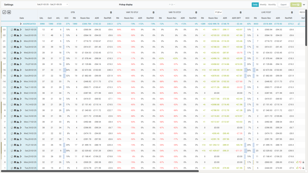
3. The Grid
Based on the parameters in the Control bar and the select view from the Tabs section, the grid will display the data, while also providing some interactive functionality:
a. Maximize / Minimize the grid display with the help of this “toggle” icon. When maximized, the menu and top bars of the app are hidden, along with the tabs section of the Timeline screen:
b. Column selection / order – when clicking this icon, users can select the data to be displayed in the grid and if the view is the “Timeline” tab, the data columns can also be ordered:
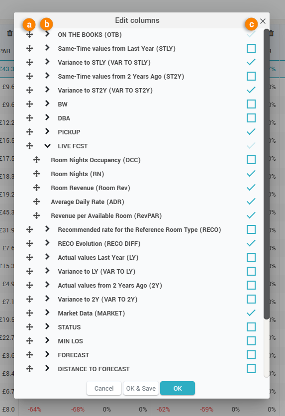
- the reorder icon (a above) allows to drag and drop the column in the preferred place.
- the “expand” selector (b above) shows the underlying columns in a column set.
- the “checkbox” (c above) allows to select which columns will be displayed in the grid.
Remember: only in the “Timeline” view users can reorder the columns. In the other views (Market Segments, Channels and Room Types) the order of the columns is defined by the “Dynamic columns sorted by” parameter in the control bar).
Tip: Choose “OK & Save” in the popup above so that the system will “remember” the selected columns and order when visiting the Timeline screen again.
c. Remove columns quickly from the grid by clicking this icon.
d. Colset Selector – this dropdown selector chooses which set of columns is to be displayed. The Pickup, BW, DBA and RECO DIFF colsets have such selectors.
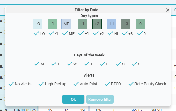
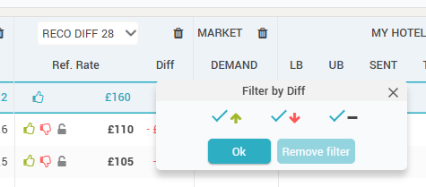
e. Column name – clicking the column name displays a filtering option:
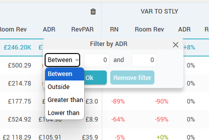
The “Date” column in the grid is a special column and it has a special filter:
The RECO DIFF column also has a special filter:
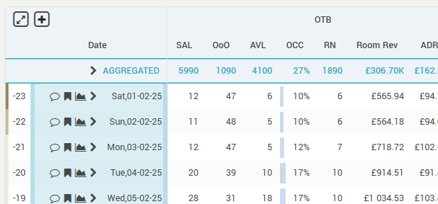
f. The “AGGREGATED” row
The grid has this special row which aggregates the data for the selected period. Depending on the column, the aggregation is either a summation (e.g. RN, Room Rev, SAL), an average (e.g. Occ, RECO, Market Demand, CompSet rates) or a formula that is applied (ADR, RevPAR). The AGGREGATED row can also be expanded and will show the sub-rows as defined by the “Subrows” and “Subrows sorted by” options in the control bar (in “Timeline” view):
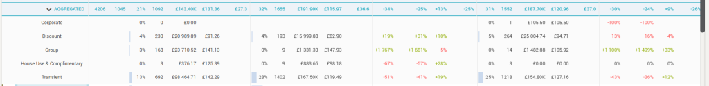
In “Market Segments”, “Channels” and “Room Types” view, the sub-rows are the fixed 5 rows below:
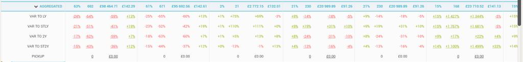
Attention: For the “BW” and “DBA” columns, the RN and Room Rev aggregation is done also as “average” and not as summation. This allows for a manual trend analysis (e.g. filtering the arrival dates based on Day Type or DOW combined with a particular period and then looking at the DBA values for the average values – trend – for the selected day type).
g. The “Header” column
The grid starts on the left-hand side with the “Header” column. This column shows the arrival date (or week number or month, depending on the granularity selected in the control bar) for which the data is displayed in the subsequent columns and also an “expand” icon (![]() ).
).
The “Expand” icon shows the sub-rows and is displayed only if the “Subrows” option in the control bar is not set to “None”.
- In “Timeline” view, the sub-rows will be displayed based on the “Subrows” and the “Subrows sorted by” options in the control bar:
- In “Market Segments”, “Channels” and “Room Types” view, the sub-rows are fixed to the below 5 sub-rows, where “PICKUP” shows the data picked up in the period controlled by the “Pickup Display” option in the control bar:
When the grid is set to display data in “Daily” granularity, the header column shows the following additional features:
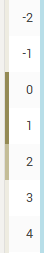
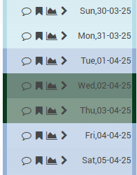
- The “Days Out” information – how many days between the respective date and the current date (so “0” when the row displays the data for “today”). This information comes also with a color-coded border to the left, visually highlighting the weekend days from the work days:
- The background for each row is color-coded to represent the season (or event category) color of the respective date:
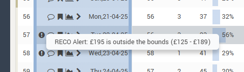
- The “Alerts” icon (
 ), showing any alerts that were triggered for the respective date:
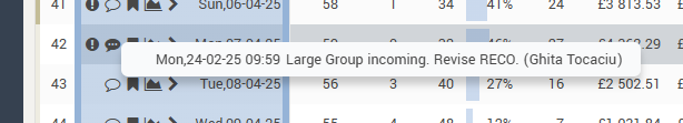
- The “Comments” icon (
 ), showing if there are any comments written for the specific date.
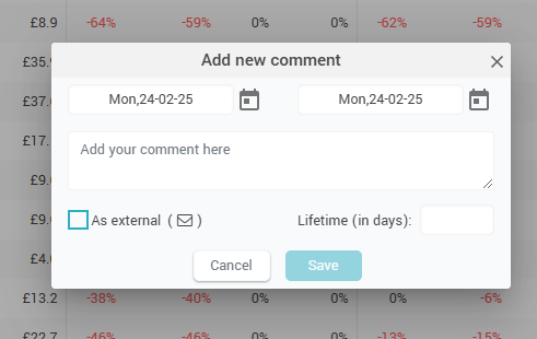
When clicking it, users can quickly add a comment directly from the Timeline grid:
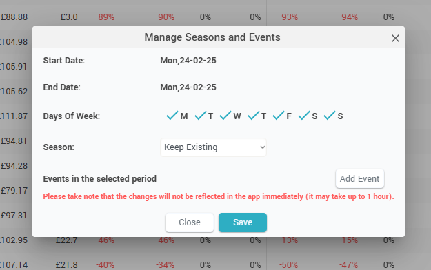
- The “Events” icon (
 ), showing on mouseover the season and the list of events happening on the respective date. When clicked, it allows quick access to manage the events for the respective date:
- The “Day Inspector” icon (
 ), showing when clicked the day inspector (“Day Inspector“).
Tip 1: hovering the mouse over an arrival date label will show the “Mini Day Inspector“.
Tip 2: Clicking on any value in the grid makes all the values from that row be displayed in “bold”.