Throughout the app, everywhere there is some information at arrival date level (e.g. the Dashboard-Daily View, Timeline, any Custom Report based on arrival dates, etc), when clicking on the arrival date or the ![]() icon , the “day inspector” will be displayed:
icon , the “day inspector” will be displayed:
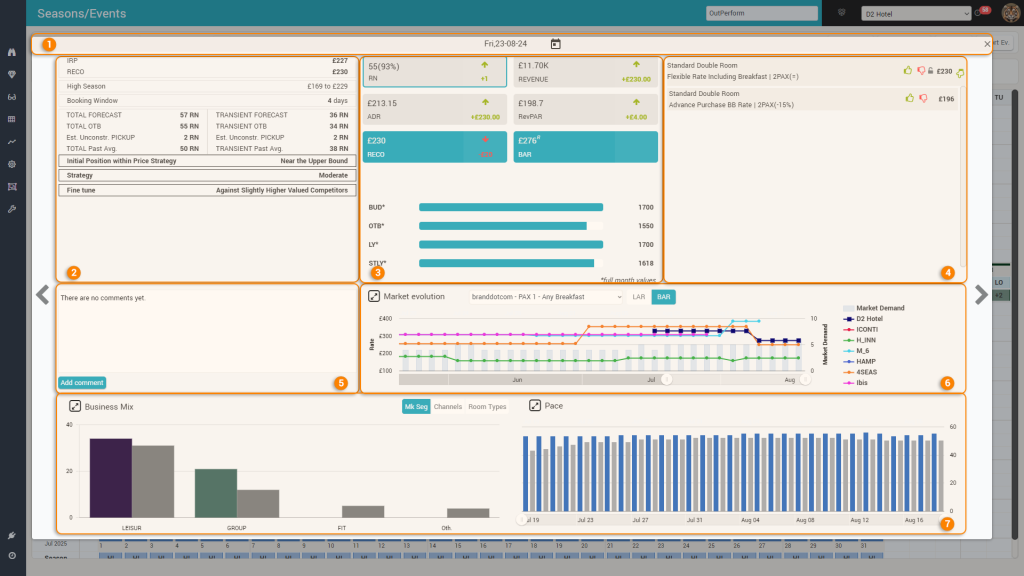
The Day Inspector provides all information for the selected arrival date:
1. The Title Bar

From the title bar you can quickly change the arrival date to be inspected by clicking the arrival date icon (option “a” above):
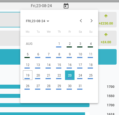
You close the day inspector popup by clicking the close icon (option “b” above).
Tip: You can quickly “navigate” between consecutive arrival dates also using the arrows displayed to the left and right of the Day Inspector.
2. The RECO Explanation area
This area shows a high-level overview of the data that is used by the RECO calculation. It displays:
- the IRP – which stands for “Internal Recommended Price” and it represents the RECO calculated solely on PMS data (business on the books data), no Market data of any kind (no CompSet rates, no Market demand). Please see the “Optimization Algorithm” page for more details.
- the RECO – this is the proposed optimal rate for the reference offer
- the season (or event category if the arrival date is marked as an event) and the bounds defined for it (from the “Hotel Rates” screen)
- the remaining booking window (how many days left before arrival)
- 2 sets of 4 values (one for TOTAL business, one for TRANSIENT):
- FORECAST – the forecast calculated by the system
- OTB – the value on the books
- Est. Unconstr. PICKUP – the estimated pickup (unconstrained – meaning it is calculated as if there would be no limit on capacity) for the remaining booking window
- Past Avg. – the weighted average business on the books in the past dates that are deemed similar to the respective arrival date (same “day type”), when there were the same amount of days before arrival as the remaining booking window.
- Final conclusion of the optimization algorithm:
- Initial Position within Price Strategy – where is the IRP positioned inside the interval defined by the bounds
- Strategy – Should you drive more occupancy (cautions strategy) or more revenue (aggressive strategy) or somewhere in between (moderate strategy)
- Fine Tune – shows which subset of competitors from the compset is used to do the adjustment of the IRP (lower valued, similarly valued, higher valued)
3. The KPI area
This area displays the main 4 KPI’s for the selected arrival date. Each KPI “card” shows the values on the books and the pickup information since “yesterday” (also known as the “P-1” value).
The 4 KPI cards are clickable (the “selected” card has a distinct border – by defult the “RN” card is the “selected” one). When changing the “selected” card, the “Business Mix” and “PACE” charts will refresh and show data for the selected KPI (see section 7 below).
It also shows the RECO and its change since the last time it was calculated.
Finally, it displays the price as scraped from the channel selected for the RECO calculation (if the hotel has multiple channels being monitored by the rate shopper), for an easy comparison of the RECO vs actual rate on the main OTA.
Below the 6 cards, there is a bar chart displaying the RN Budget defined by the user for the month of the arrival date, the monthly OTB RN value, the actual RN of Last Year and the RN from Same Time Last Year (all values are for the full month of the arrival date).
Remember: You can click any of the 4 KPI’s cards to “select” which KPI is shown in the Business Mix and PACE charts in the lower part of the Day Inspector.
4. The “Pricing” Area
This area shows a list with all the offers that are mapped for distribution and allows the possibility to like/dislike the RECO, quickly set a new price for any offer (after disliking the RECO) and also “lock/unlock” the reference offer (this is the one displayed on top in the list).
5. The “Comments” Section
This section allows viewing and managing comments for the respective arrival date. More information on comments can be found in the dedicated “Comments” page.
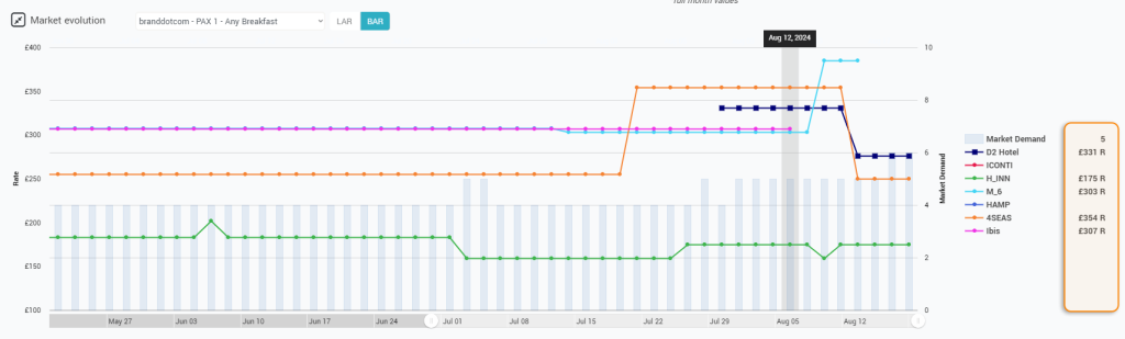
6. The “Market Evolution” chart
This chart shows the price evolution of the subscriber and competitor hotels for the selected arrival date during the last 3 months:
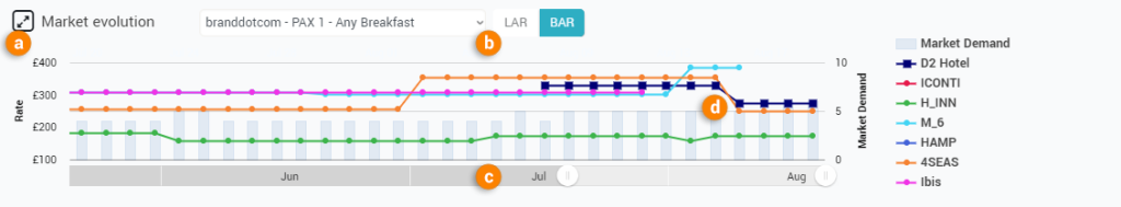
- “a” – The resize icon allows to make the chart a bit bigger
- “b” – you can select the channel/pax/breakfast for which you wish to see the prices + also if the rates displayed should be the ones marked as BAR (best avl rate – only non-restrictive rates if possible) or LAR (lowest avl. rate – any rate shopped, including restrictive ones)
- “c” – the chart’s “zoom” option which allows to see the entire 3 months evolution in one go
- “d” – when hovering over a day in the chart, the values shopped on that particular day are displayed next to the corresponding property in the “legend” section of the chart:
7. The “Business Mix” and “PACE” charts
These 2 charts display the “breakdown” of the values on the books based on the selected segmentation (“Business Mix”) and the “PACE” for the selected KPI and segment:
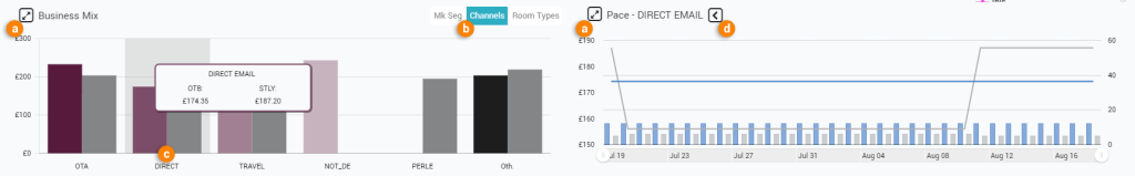
Both charts display information for both the selected arrival date (colored) and also STLY (in grey).
- “a”: both charts can be expanded/contracted (just like the “Market Evolution” chart above)
- “b”: depending on the connected PMS system, you can change the segmentation shown in the “Business Mix” chart
- “c”: when hovering the mouse over one segment, a tooltip appears with the values. If you click the area (or the name of the segment just below the “bars”), the “PACE” chart will show the evolution of the selected KPI and segment (during the last 30 days)
- “d”: this icon appears only if a segment has been selected in the “Business Mix” chart. When clicked, it will make the “PACE” chart revert to displaying the PACE info for the selected KPI in TOTAL (not only for a selected segment), which is the “default” behavior.
The “PACE” chart will always display the PACE of the RN. When any other KPI is selected (see section 3 above), it will change into a “combo” chart, displaying the PACE for both RN and the selected KPI (as seen above in the screenshot).
The “Business Mix” chart will display “Revenue” breakdown when both “Revenue” and “RevPar” are selected (as there can be no “RevPAR” segmentation).
Remember: Once a segment is clicked in the “Business Mix” chart, the PACE chart will refresh to show the evolution of the selected KPI only for the clicked segment. You revert to default PACE display by clicking the “revert” icon (option “d” above).