This screen is the access point to all the custom reports a user has created or was selected by another user to “use” a report (“sharing”).
The screen has the following layout:
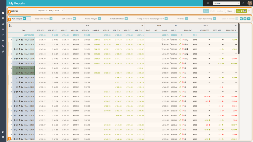
1. The “Control” Bar
Allows the user to quickly change base parameters for the current report being viewed. When reports are created, users can decide which of the base controls are allowed to be changed. The controls are:

a. The timeframe of the report
b. The Granularity
c. The Second Dimension – holding the segmentation by which each day (or week / month depending on granularity) can be “opened”.
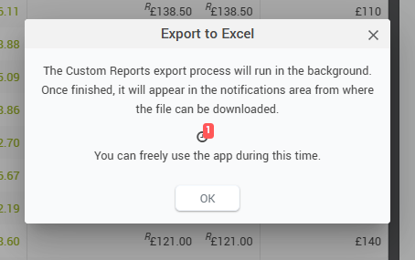
d. The Export button – can be used to export the report to xls, which is prepared in the background and can be downloaded once finished:
e. The Refresh button – will reload the report based on the new control parameter values.
f. The “Refresh and Save Filters” button – will refresh the report but also will quickly change the default values of the base controls for the current report to be the newly selected ones.
g. The “Send” button – will start the sending process to the receiving system (read more in “The Send button” page).
Remember: some of the base controls may be “disabled”. This happens when the report is defined to not allow changing those parameters.
2. The Tab bar
The reports created by the user + other reports the user can use as they were shared by others are found and can be managed from this area of the screen:

- This is the list with the reports. Clicking on the corresponding tab will open the respective report.
- a. Each report can be edited by clicking the edit icon. Editing a report follows the same process as creating a new report, so please see below the section for creating a new report
- b. If there are a lot of reports, the tab list will show the two “scroll buttons” to the left and right of the tabs.
- This icon allows quick search and access to a particular report:
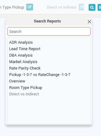
Attention: reports that contain specific columns from other hotels appear with faded color (e.g. “Direct vs Indirect” report in the screenshot). - This icon allows management of the reports:
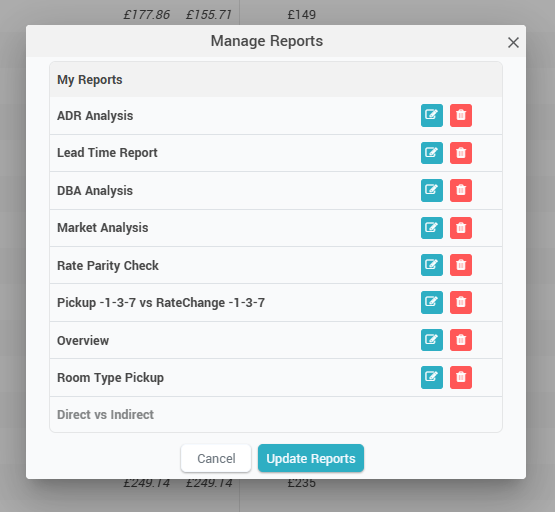
When clicked, the above popup appears which allows to reorder the reports by drag-and-drop, to edit reports (same process as creating a new report, see below) and to delete particular reports. - This icon allows users to create a new report. Please see the section about creating reports below
3. The Report area – the “Grid”
This area of the screen loads the selected report. The custom reports have all the functions that any other grid-based report has throughout the app:
a. Maximize / Minimize the grid display with the help of this “toggle” icon. When maximized, the menu and top bars of the app are hidden, along with the tabs section.
b. Remove columns quickly from the report by clicking this icon.
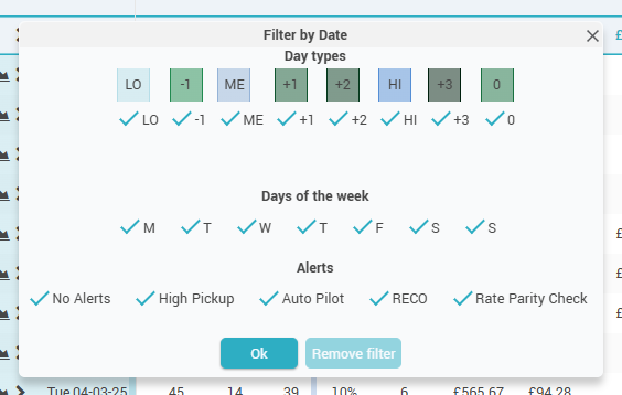
c. Column name – clicking the column name displays a quick filtering option:
Currently, only the “Date” column allows to define a quick filter:
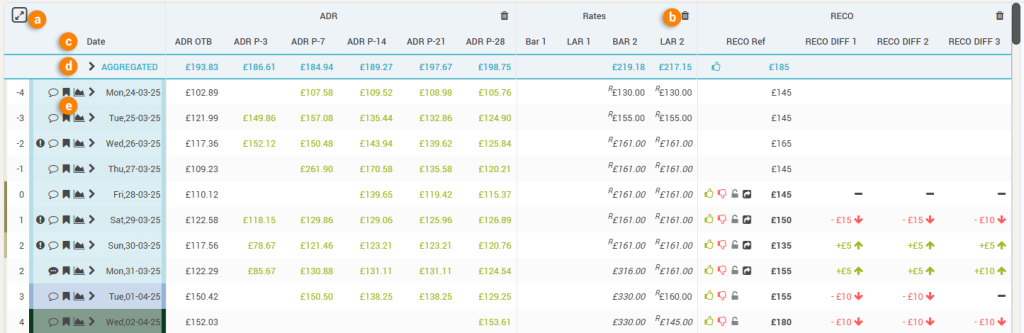
d. The “AGGREGATED” row
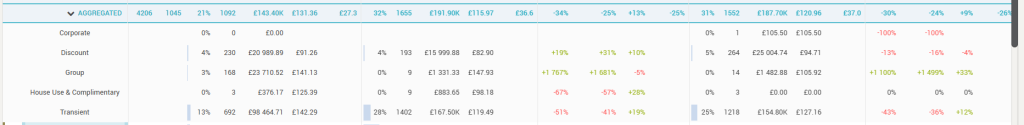
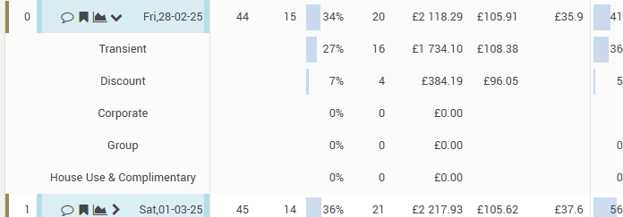
Every report has this special row which aggregates the data for the selected period. Depending on the columns in the report, the aggregation is either a summation (e.g. RN, Room Rev, SAL), an average (e.g. Occ, RECO, Market Demand, CompSet rates) or a formula that is applied (ADR, RevPAR). The AGGREGATED row can also be expanded and will show the sub-rows as defined by the “Second Dimension” parameter in the control bar:
e. The “Header” column
All reports starts on the left-hand side with the “Header” column. This column shows the arrival date (or week number or month, depending on the granularity selected in the control bar) for which the data is displayed in the subsequent columns and also an “expand” icon (![]() ).
).
The “Expand” icon shows the sub-rows and is displayed only if the “Second Dimension” option in the control bar is not set to “None”:
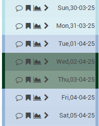
When the report is set to display data in “Daily” granularity, the header column shows the following additional features:
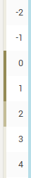
- The “Days Out” information – how many days between the respective date and the current date (so “0” when the row displays the data for “today”). This information comes also with a color-coded border to the left, visually highlighting the weekend days from the work days:
- The background for each row is color-coded to represent the season (or event category) color of the respective date:
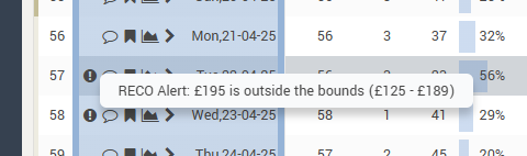
- The “Alerts” icon (
 ), showing any alerts that were triggered for the respective date:
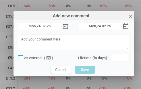
- The “Comments” icon (
 ), showing if there are any comments written for the specific date.
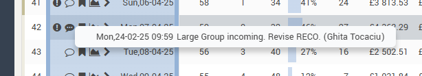
When clicking it, users can quickly add a comment directly from the report:
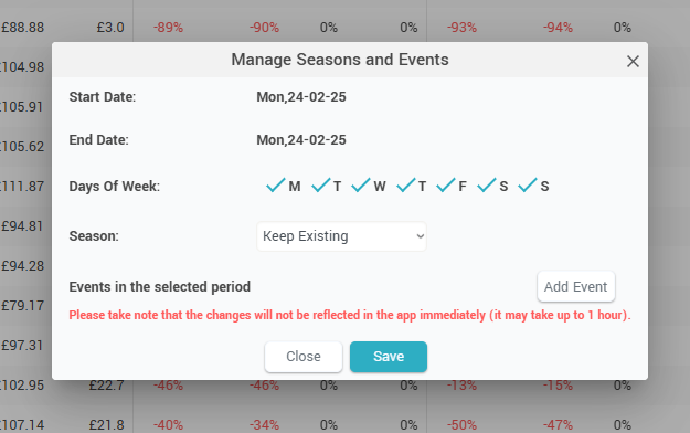
- The “Events” icon (
 ), showing on mouseover the season and the list of events happening on the respective date. When clicked, it allows quick access to manage the events for the respective date:
- The “Day Inspector” icon (
 ), showing when clicked the day inspector (“Day Inspector“).
Tip 1: hovering the mouse over an arrival date label will show the “Mini Day Inspector“.
Tip 2: Clicking on any value in the grid makes all the values from that row be displayed in “bold”.
Creating a Custom Report
The creation of a custom report is a three-step process.
Step 1: General Information
In this first step, users have to put in the name of the report, select if the new report will be created from a blank “canvas” or is it a copy of another report, and select the visibility of the report:
- Private – this means the report is available to be used only by the user that created it.
- Shared – this means the report can be used (but not modified or deleted) by other users, selected from a list:
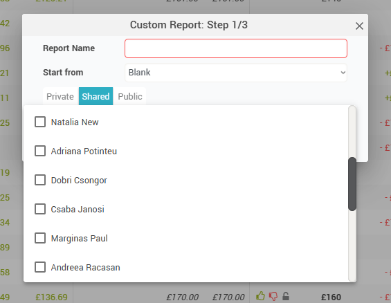
- Public – this means that the report can be previewed and “cloned” by any other user.
Step 2: Format and base parameters
In this step the user selects how the report is formatted and also the default values for the base parameters:
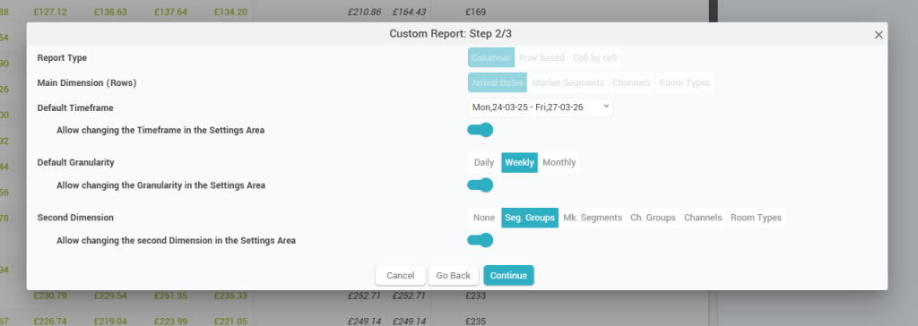
Attention: at the moment, only “Columnar” reports by “Arrival date” can be created; this means that the rows represent the main dimension (“Arrival Date”) and the user can choose which data is to be presented as columns of the report.
Users can also choose for each base parameter (Timeframe, Granularity, and Second Dimension) if they are allowed to be changed or not when viewing the report.
Remember: All reports have column groups which are used to group similar columns together. It is not possible to have data columns “outside” any column group.
Step 3 – Report Data
In this step the user defines the columns of the report and what data will they display. The screen has 3 areas:
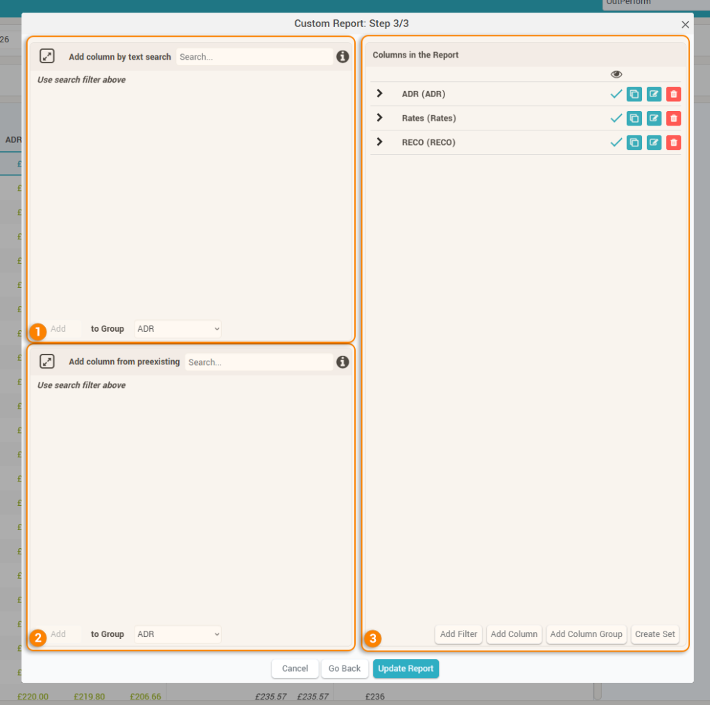
1. Add column by text search
This area allows to quickly add data columns in the report by writing a text phrase in the dedicated input:
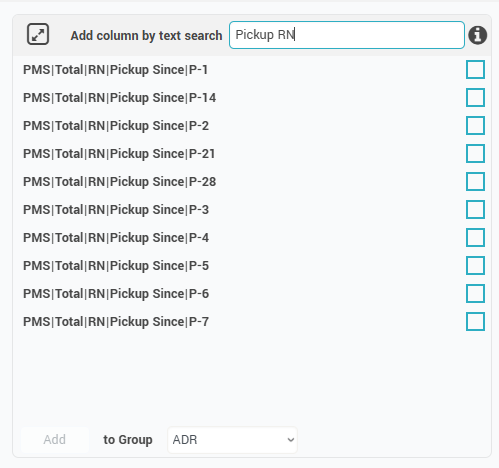
Tip: The search is performed word by word; to search for a fixed phrase or a set of characters, double-quotations must be used. E.g., searching for D-1 will return also columns for D-14; to make sure only D-1 columns are returned, the search must be for “D-1”.
Once the search is performed, the user can select one ore more data points and then select the column group where they will go as new columns the moment the “Add” button is clicked.
Remember: if no column groups have yet been created, the column group selector will show the “Add to a new group” option:

In this case, before the columns are added to the report, the user will be prompted for a name for the new column group:

2. Add column from preexisting
This section allows users to add data columns to the report by “importing” them from other reports they have access to:
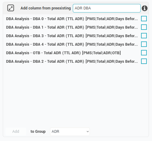
The search function is the same as when adding columns by text search (see above), with the added thing that users can also search by report name.
Adding the selected columns also works in the same way as above.
3. Columns in the Report
This section allows management of columns, column groups, column sets and filters:
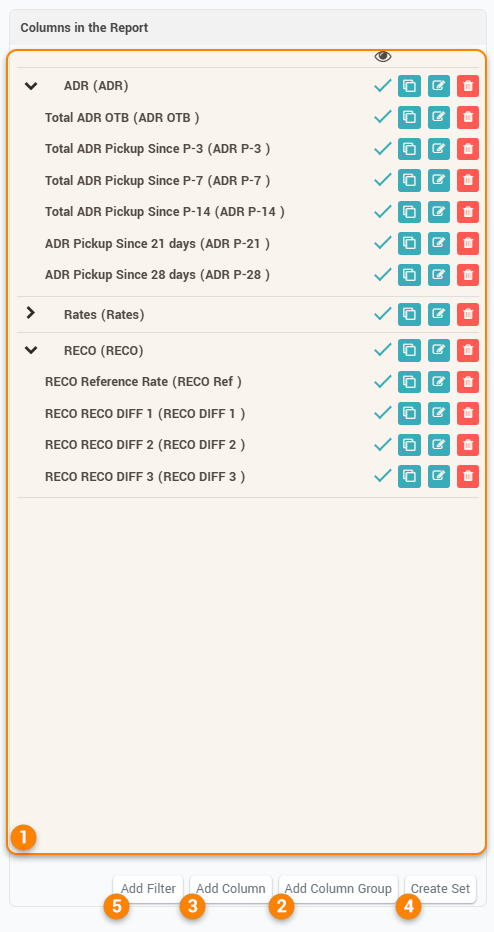
1. Column list – this section shows all the current data columns and how they are “arranged” in the various column groups.
Columns can be rearranged inside their designated column group by drag-and-drop.
Attention: columns cannot be moved to a new column group by drag-and-drop. To move a data column to a new column group the “edit column” feature must be used (see below).
Each column can be marked to be visible in the report or not. This is useful for example when the report is set to display certain data points based on a filter of other data points – in such case all data points must be present in the report as data columns, but only the columns needed for display are marked as visible.
Columns can also be “copied” quickly by clicking the ![]() icon. When clicked, the below popup is displayed, allowing the user to immediately edit the copy of the column:
icon. When clicked, the below popup is displayed, allowing the user to immediately edit the copy of the column:
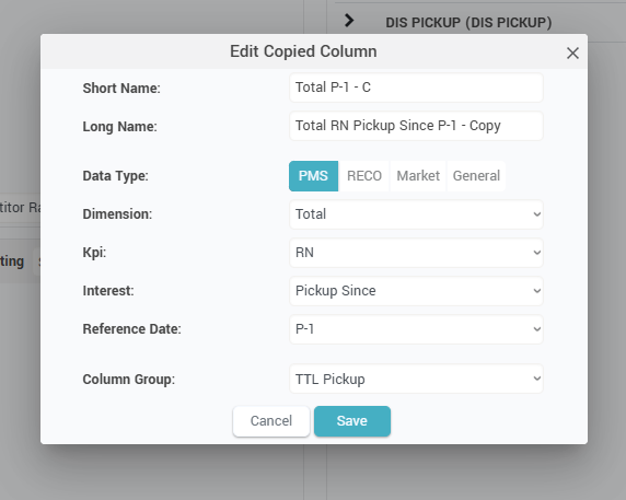
Remember: when copying columns, the system will automatically add “- C” and “- Copy” to the short and long names of the newly copied column.
Columns can be edited by clicking the ![]() icon. A similar popup appears, allowing the user to change the short/long name of the column and also the data definition. You can see more info about the column data definition below (the “Add new column” paragraph).
icon. A similar popup appears, allowing the user to change the short/long name of the column and also the data definition. You can see more info about the column data definition below (the “Add new column” paragraph).
Also in this popup users can decide to move the column to a new column group or not, by changing the selected option in the “Column Group” dropdown.
Columns can be deleted from the report by clicking the ![]() icon.
icon.
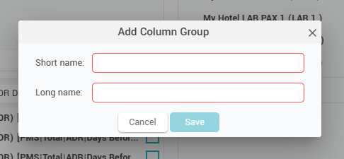
2. Add Column Group – this button allows the creation of a new column group:
3. Add Column – this button allows adding a new column to the report:
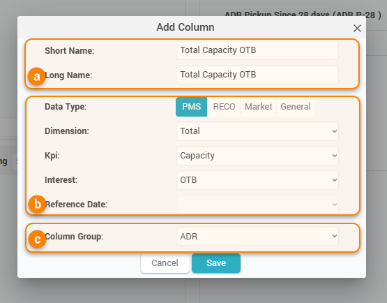
Based on the selected data options (b above), the system will suggest a short name and a long name for the new column (a above).
The data options allow users to select pretty much any data that the system has. The data is split in 4 categories:
- PMS data – all the property’s business data is in here
- Dimension – selects the “level” of the data, from “Total” which means property level to all the available segments (segment groups, market segments, channels, or room types).
- KPI – selects the KPI to be displayed. Examples include Occ, RN, RevPAR, ADR
- Interest – selects the “point of view” for the KPI. Here you have options like “OTB”, “STLY”, “Dist. to Budget”, “Pickup Since”, “Days before arrival”, “Booking window”, etc.
- Reference Date – available if the Interest is either “Pickup Since”, “Days before arrival”, or “Booking window”. It allows to select the reference period for the selected interest, e.g. “P-2”, “BW 8-14”, “DBA 3”, etc.
- RECO data – this is where the recommendation info is to be selected
- Type: RECO or RECO DIFF – choose if the RECO is to be displayed or the difference between RECO’s
- Value:
- if the “Type” is RECO, the value can be the “Reference Rate” (shows the recommendation for the optimal rate for the reference offer), “O/C” (shows the recommendation for Open/Close restriction), or “MinLOS” (show the recommendation for the minLOS restriction)
- if the “Type” is RECO DIFF, the value represents the number of days for the difference. E.g. a value of 3 means the column would display the difference between the RECO today vs 3 days ago.
- Market data – all the data related to the competitors and the market demand is here
- Item – represents either one of the properties (subscriber or competitor), or “CompSet Median”, “Market Demand” or “Avg Min Rate”
- If a hotel or the “CompSet Median” item is selected, users can select the rate (LAR or BAR), the source (channel), the PAX (1, 2) and the breakfast option which they want to see in the column
- If “Market Demand” or “Avg Min Rate” items are selected, these options are not available
- Item – represents either one of the properties (subscriber or competitor), or “CompSet Median”, “Market Demand” or “Avg Min Rate”
- General data – the following options are currently available:
- DoW – from 0 to 6 (0 for Sunday)
- Day Type – the season or event category code
- Alert Type – an icon showing the alert
- Comments – an icon showing any comments
- Lower Bound – the lower bound for the season or event category
- Upper Bound – the upper bound for the season or event category
- Reference Rate to be Sent – if there are any rates prepared for sending, this data column would display the value that would be sent for the reference offer
- Reference Rate Sent – displays the last value sent for the reference offer. On mouseover, the change from the previously sent value is visible:
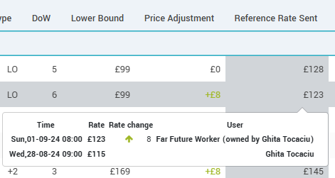
- Price Adjustment – displays the difference between the last value sent for the reference offer and the previous value sent before
- MLoS Actual – displays the minLOS restriction
- Attention: General data columns are “linked” to arrival dates; as such they are useful only for “Daily” granularity; in “Weekly” or “Monthly” granularity nothing is displayed.
The last thing to do is to select the column group under which the new column will be placed (c above).
Clicking “Save” will add the new column to the report.
4. Create Set
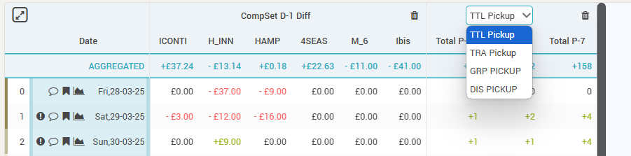
Column groups can be displayed as a “set”. This means they will occupy only one “visual” slot in the report, saving horizontal space:
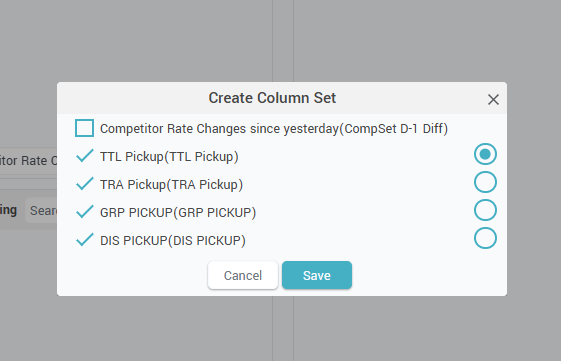
After clicking the “Create Set” button, the above popup appears, allowing the selection of the columns that go in the set, plus the selection of the first column that will be displayed in the report.
Below two examples of the same report:
- Without column set
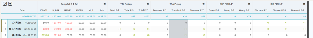
- with Column set:
5. Add Filter
A persistent filter can be created for every report. This means that the report will always load with its data filtered based on the filter conditions.
Complex filters can be created (one maximum 3 levels). Each level can be either an “AND” operation or an “OR” operation between its conditions.
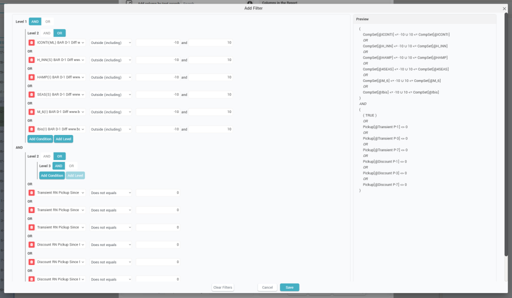
Within each level, any column from the report can be added as a condition with various filtering options: “Equals”, “Does not Equal”, “Greater than”, “Greater than or Equals”, “Lower than”, “Lower than or Equals”, “Outside (including)”, “Outside (excluding)”, “Between (including)”, “Between (excluding)”.
Filters can be quickly cleared by clicking the “Clear Filters” button.
A report that has a filter is identified by the presence of the “Filter” icon (a below):
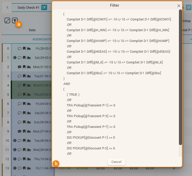
When clicked, a popup appears displaying the filter definition (b above).
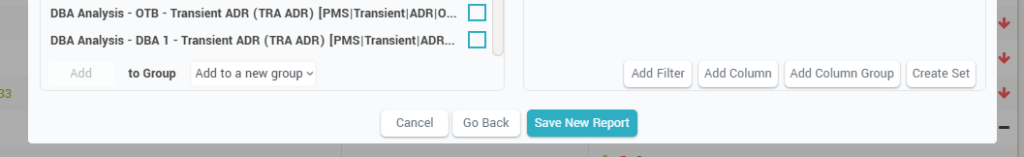
Once all desired columns are created, clicking the “Save New Report” button will save the report:
Remember: Custom reports can be sent automatically as email attachments using the “Auto Emails” functionality.